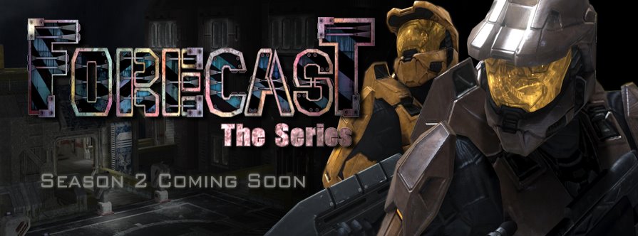
Well I've spent the better part of the last few hours rearranging the layout of the site. As you can see we've gone from a 2 column format to a 3 column format (who know I could learn a little html code in a short period of time). We've also added a new banner for the page featuring Craig and Eugene, along with our new logo that most of you should remember from the Season 2 Teaser.
The logo was created by a friend of mine named
Matt Janzen. He's a phenomenal artist who used to work out in Seattle for a video game company. Jump on over to his
website and have a look at some of the characters he is currently working on.
Hope you enjoy the different layout. Now I'm off to sleep.


3 comments:
Cool layout, Can't wait to see you start Season 2.
same here. Can you give us a month?
Post a Comment